What Is A Squeeze Page? How To Build One That Converts Like Crazy
Explore what a squeeze page is, why it matters for your strategy, how to build one that converts, and how FERMÀT helps boost your lead generation results.
Key Takeaways:
- Essentials: Discover the essential elements that make a squeeze page convert, from compelling offers to strong CTAs.
- Pitfalls: Learn how to avoid the most common squeeze page mistakes that kill conversion rates.
- Optimization: See how FERMÀT can enhance your squeeze page performance through personalization, A/B testing, and seamless page-building tools.
At FERMÀT, we’ve redefined what commerce looks like in the creator economy—helping leading brands like True Botanicals, Our Place, and Topicals break free from traditional PDPs and build personalized, contextual shopping experiences. Our technology powers some of the most innovative on-site journeys in eCommerce today, turning inspiration into action faster and smarter than ever before.
In a world where attention spans are shrinking and brand loyalty is fleeting, capturing user interest quickly—and converting that interest into a tangible relationship—is more critical than ever. That’s where squeeze pages come into play. These focused, frictionless web pages have become the secret weapon for high-converting lead generation. By combining strong visual cues, personalized messaging, and irresistible offers, a squeeze page becomes the gateway to building your owned audience. Whether you're an emerging DTC brand or an established retail player, mastering the squeeze page is no longer optional—it's essential.
In this piece, we’ll be discussing what a squeeze page is, why it’s crucial for your marketing funnel, and how to build one that converts like crazy.
What Is A Squeeze Page?
A squeeze page is a type of landing page designed with one clear goal: to capture a visitor’s email address or other contact information. Unlike broader marketing pages, squeeze pages are hyper-focused, offering minimal distractions and a clear value proposition in exchange for the visitor's details.
Think of a squeeze page as a digital gatekeeper. In exchange for something valuable—like a free eBook, discount, webinar, or exclusive content—you ask users to provide their email. The term “squeeze” comes from the idea of squeezing this crucial piece of information from your visitor before they move on. Key Characteristics of a Squeeze Page:
- Single Purpose: Get the visitor’s contact info.
- Minimal Navigation: Usually, there are no external links or menus to keep attention fixed.
- Persuasive Copy: Strong headlines and benefits-focused messaging.
- Call to Action: A clear and compelling button or form that tells users what to do next.
- Incentive or Offer: Something of value is given in return—this is often referred to as a "lead magnet."
These pages are incredibly effective for growing email lists, building lead funnels, and preparing prospects for future sales or nurturing campaigns.

Why Are Squeeze Pages Important?
Squeeze pages are more than just email capture forms—they are strategic tools that give marketers control, clarity, and conversions. Here’s why they matter so much in today’s digital marketing ecosystem:
They Increase Conversion Rates
Squeeze pages are stripped of all distractions—no nav bars, sidebars, or unnecessary links. This laser focus on a single call-to-action boosts the likelihood that a visitor will complete the intended action, typically submitting their email.
They Support List Building
With a well-structured squeeze page, you can grow a high-quality email list of users already interested in what you offer. This list becomes a powerful asset for future promotions, launches, and ongoing engagement.
They Are Perfect for A/B Testing
Because of their simplicity, squeeze pages make ab testing easy and impactful. Small changes like button text, form layout, or headline structure can lead to significant increases in conversion rates.
They Align With User Intent
When someone clicks on an ad or email link offering a free resource or exclusive deal, a matching squeeze page validates that intent. Consistency between the message and the offer boosts trust and action.
They Make Funnels More Effective
Squeeze pages often serve as the gateway to your sales or email nurture funnel. By capturing information early, you can segment leads and guide them down tailored paths that increase the chance of a conversion.
Key Elements Of A High-Converting Squeeze Page
Creating a successful squeeze page isn't about packing it with content—it's about focusing on the right components. Here's a breakdown of the elements that consistently drive conversions:
Compelling Headline
Your headline is the hook. It needs to immediately grab attention and clearly communicate the value the visitor will receive. A strong headline sets the tone and keeps visitors from bouncing.
Clear And Enticing Offer
The offer is what convinces users to give up their email. Whether it's a free eBook, a limited-time discount, or an exclusive webinar, the perceived value must be high. The clearer and more specific the offer, the more likely users are to convert.
Minimal Distractions
The best-performing squeeze pages are laser-focused on one objective. That means no navigation menus, sidebars, or unnecessary links. By eliminating distractions, you keep users focused solely on completing your form.
Persuasive Copy
Your copy should speak directly to the user's needs and desires. Use short paragraphs, active language, and bullet points to keep it digestible. The goal is to highlight benefits, not features, and move the reader toward action.
Optimized Visuals
Visuals should reinforce the message, not distract from it. A relevant image, product shot, or short video can increase credibility and understanding. Avoid stocky or irrelevant images that don’t support your value proposition.
Trust Elements
People hesitate to share personal info if they don’t trust you. Add social proof like testimonials, trust badges, or guarantees to build confidence. A short note about privacy or how their email will be used can also ease concerns.
Strong Call to Action
Your CTA button should be visually prominent and use persuasive language. Instead of “Submit,” use specific phrases like “Get My Free Guide” or “Claim My Discount.” Button placement also matters—don’t make users scroll endlessly to find it.
Simple, Short Form
The fewer the fields, the better your conversions. Typically, just asking for an email address works best. If you need more info, explain why and ensure the added friction is worth it for the user.
How To Build A Squeeze Page That Converts Like Crazy
Creating a squeeze page that delivers serious results takes more than throwing together a form and a headline. It’s about intentional design, strategic messaging, and ongoing optimization. Follow these steps to build a page that doesn’t just collect emails, but collects them in droves.
Start With A Clear Goal
Know exactly what you want your visitors to do. Whether it’s downloading a guide or signing up for a webinar, your entire page should drive toward that single conversion point. This clarity keeps your messaging focused and compelling.
Craft A Magnetic Offer
Your offer should solve a real problem or meet a strong desire. It needs to be both relevant to your audience and valuable enough for them to trade their email for it. Think cheat sheets, exclusive discounts, early access, or tools they can’t find elsewhere.
Write Benefit-Driven Copy
Focus on what the user gains, not just what the offer is. Use persuasive language, emphasize outcomes, and remove any doubt or hesitation. Clarity, simplicity, and emotional appeal go a long way.
Design For Simplicity And Focus
Eliminate all unnecessary elements. No menus, no footers, no competing links. Keep the layout clean and make sure your call-to-action stands out—visually and contextually.
Use Attention-Grabbing Visuals
Visuals should support the value of your offer. A mockup of your guide, a quick demo clip, or a product preview can give visitors a better sense of what they’re getting. Keep the design cohesive and professional.
Optimize The Form
Ask for the bare minimum—usually just an email address. If you must ask for more, explain why it benefits them. The shorter the form, the lower the resistance.
Add Trust Elements
Don’t forget to build credibility. Include testimonials, user counts, trust badges, or a short privacy reassurance to put hesitant users at ease.

Test And Iterate
Launching is just the beginning. Run regular ab testing to optimize headlines, button colors, CTA phrasing, and form layout. Over time, these small adjustments can make a big difference in your conversion rate.
Consider Where It Fits In Your Funnel
A squeeze page doesn’t live in isolation. Think about what comes before and after—ads, email sequences, or even your product detail page (PDP). Each touchpoint should feel cohesive and intentional.
Use The Right Tools
You don’t need to be a developer. Plenty of tools help you create a landing page easily and effectively. Choose one that allows customization, integrations, and A/B testing so you can fine-tune your strategy over time.
Common Mistakes To Avoid
Even great offers can fall flat if your squeeze page suffers from strategic or technical missteps. Here are the most common errors that marketers make—and why you should steer clear of them:
Including Too Many Distractions
Navigation menus, sidebars, social media links, or unrelated content can pull users away from your main goal. A squeeze page should be laser-focused on a single action—capturing the visitor’s information. Eliminate all exit points except the CTA.
Offering A Weak Or Vague Incentive
Visitors won’t share their email without a strong reason. If your offer is generic, unclear, or lacks perceived value, they’ll simply leave. Be specific and highlight exactly what they’ll gain by signing up.
Using Overly Long Forms
Every additional field increases friction. Asking for too much too soon (like phone numbers or detailed personal info) can scare users away. Stick to the essentials—usually just the email, and maybe a first name.
Having An Unclear Or Weak Call To Action
If your CTA is generic ("Submit") or buried beneath the fold, it won’t inspire action. Use bold, action-oriented phrases like “Get My Free Guide” and place the CTA prominently on the page. Make it obvious and compelling.
Neglecting Mobile Optimization
A large percentage of traffic comes from mobile devices. If your page isn’t responsive, or if buttons and forms are hard to use on small screens, you’ll lose leads. Make sure your design works seamlessly across all devices.
Lacking Trust-Building Elements
Users are hesitant to provide contact info unless they trust you. Including testimonials, data privacy assurances, or badges can reduce anxiety and boost credibility. A simple “we’ll never spam you” note can go a long way.
Ignoring Analytics And A/B Testing
Launching your page is just the beginning. Without tracking and ab testing, you’re flying blind. Monitor what works, tweak accordingly, and continuously optimize for better conversions.
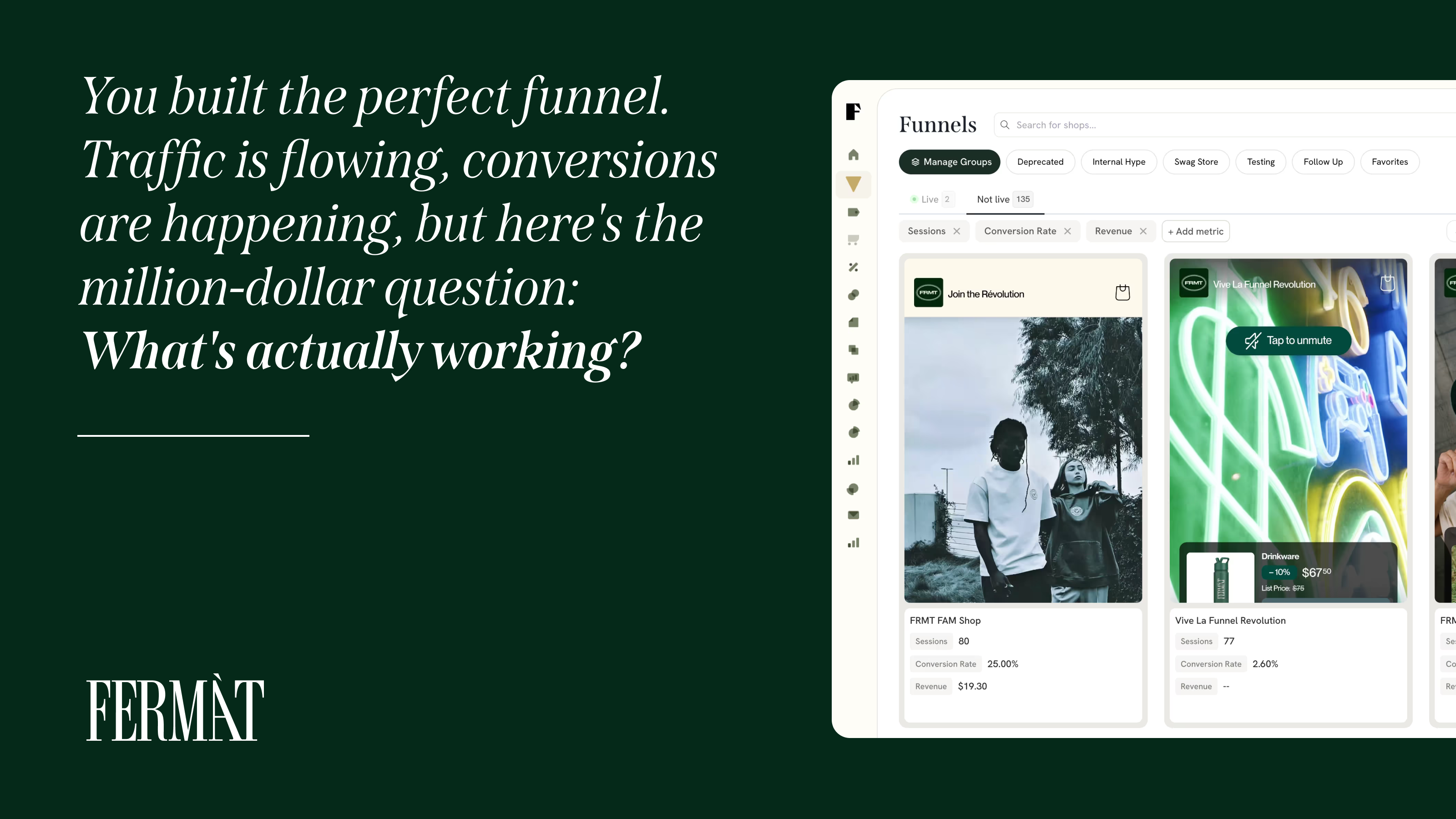
How FERMÀT Can Help You Optimize Your Squeeze Pages
FERMÀT is built to empower brands and marketers to create more personalized, dynamic, and conversion-optimized commerce experiences—including squeeze pages. Whether you’re just starting or looking to scale your lead generation efforts, FERMÀT provides powerful tools and insights to help your pages perform at their best.
Dynamic Personalization At Scale
FERMÀT enables you to serve personalized content based on user behavior, traffic source, or segment. This means your squeeze pages can speak directly to different user needs, increasing relevance and conversions. Personalization is no longer a “nice to have”—it's a performance driver.
Data-Driven Optimization With A/B Testing
With built-in ab testing capabilities, FERMÀT lets you experiment with headlines, CTAs, visuals, and copy variations. The platform provides actionable insights so you can continuously improve your squeeze page strategy based on real-time data.
Integrated Page-Building Workflows
Not a developer? No problem. FERMÀT makes it easy to create a landing page with a user-friendly interface, flexible design tools, and fast deployment features. You can launch and iterate without the usual dev delays.
Support For Conversion Funnels And PDP Integration
Your squeeze page doesn’t operate in a vacuum—it’s part of a larger funnel. FERMÀT allows seamless integration with your product detail pages (PDPs), email platforms, and conversion sequences. This ensures a consistent user experience across every step of the buyer journey.
Built-In Trust And Compliance Features
The platform includes customizable modules for trust signals, privacy compliance, and social proof. This helps reduce form abandonment and reinforces user confidence, improving your opt-in rate.
Speed, Performance & Scalability
FERMÀT’s tech stack is built for speed. Fast-loading pages improve user experience, lower bounce rates, and boost your overall performance metrics—even at scale.

Final Thoughts
A well-crafted squeeze page can be a game-changer for any brand or marketer aiming to grow their email list, nurture leads, or drive targeted conversions. But to build one that truly performs, you need more than a form and a flashy headline—you need strategic intent, focused design, and continuous testing.
By understanding what makes squeeze pages work, avoiding common pitfalls, and leveraging tools like FERMÀT, you’re not just building a page—you’re building a system for sustainable growth. Whether you're experimenting with a new lead magnet, optimizing your CTA, or integrating with your PDP, remember: simplicity, clarity, and value win every time.
So, if you’re serious about conversion, don’t just create a squeeze page. Create one that converts like crazy.
Read also:
- 10 Conversion Rate Optimization Best Practices You Should Be Using in 2025
- 25 Call to Action Examples That Actually Get Clicks
- Mastering Customer Journey Management: From First Click to Loyal Advocate
Frequently Asked Questions About Squeeze Pages
What’s the difference between a squeeze page and a regular landing page?
While all squeeze pages are landing pages, not all landing pages are squeeze pages. A squeeze page has one job—capture email addresses—while a landing page might have broader goals like promoting a product, getting webinar signups, or offering multiple actions.
Can I use a squeeze page for eCommerce?
Yes! In eCommerce, squeeze pages can be used to collect emails before product launches, offer first-time visitor discounts, or build hype for exclusive drops. It’s a great tactic to warm up leads before sending them to your main product catalog or PDP.
Is a squeeze page effective without an offer?
Rarely. People are protective of their contact info, so without a compelling offer—like a discount or valuable resource—conversion rates will be low. An “opt-in” with no clear benefit typically underperforms.
How do I drive traffic to a squeeze page?
You can send traffic via paid ads (Google, Facebook), organic content, email campaigns, or even link placements on your website. For best results, align the traffic source’s messaging with the squeeze page’s headline and offer.
How many squeeze pages should I have?
There’s no magic number, but ideally, you should create different squeeze pages tailored to different audiences or campaigns. Segmenting your offers this way allows for better targeting and more relevant lead nurturing.
Can I SEO-optimize a squeeze page?
It’s possible, but tricky. Since squeeze pages are minimal by design, there's less content for search engines to crawl. You can improve SEO with fast loading speeds, relevant meta tags, and by linking to it from blog content or authority pages.
Do squeeze pages work for B2B?
Absolutely. B2B marketers often use squeeze pages to promote whitepapers, industry reports, and webinars. The key is to ensure the offer aligns with the professional goals and pain points of your target industry.
How do I know if my squeeze page is performing well?
Key performance indicators (KPIs) include conversion rate, bounce rate, time on page, and email sign-up volume. Run regular ab testing to identify and improve weak areas.
Should I use popups as squeeze pages?
Popups can function like squeeze pages and are often used for similar purposes. However, they can be intrusive if not timed or triggered correctly. Use sparingly and make sure the value is worth the interruption.
What should I do after someone opts in on a squeeze page?
Immediately deliver on your promise (e.g., send the lead magnet), and direct them into a follow-up sequence. This might include a thank-you page, onboarding emails, or even redirecting to a product detail page (PDP) for further engagement.